
Simplex
BRANDING
MOTION
DISEÑO
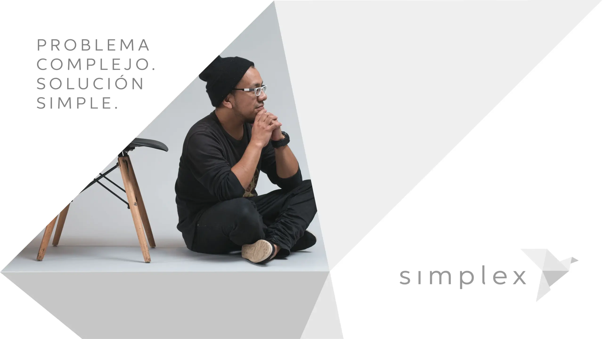
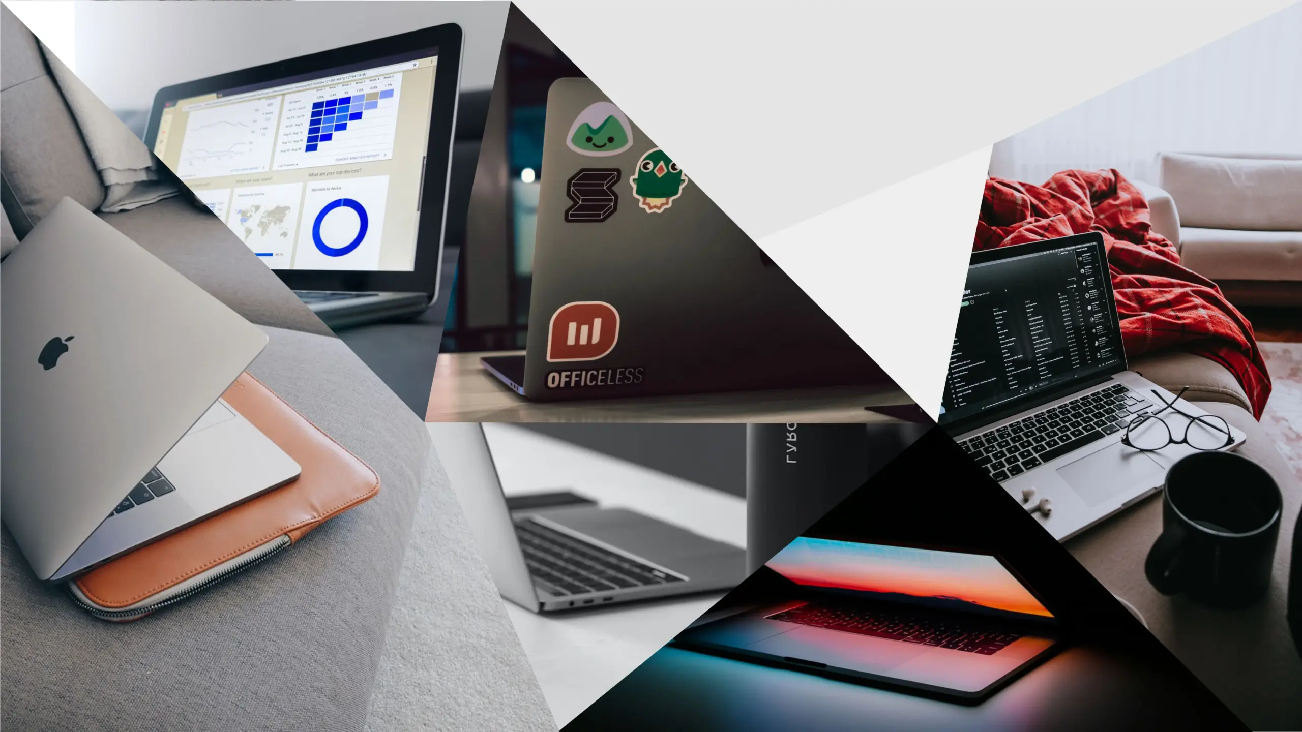
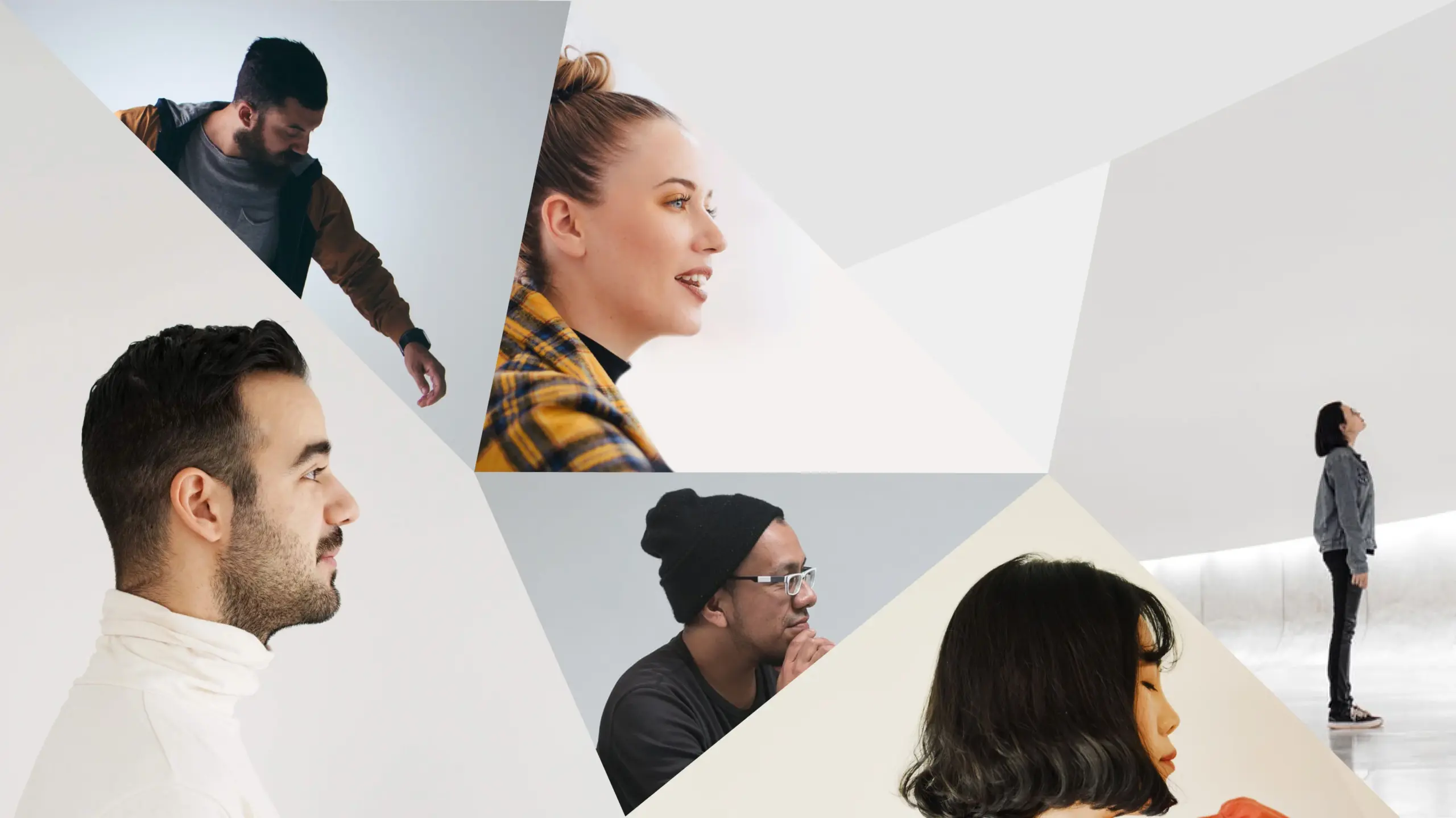
There was a need to refresh a visual identity that—like many startup founders—they had designed themselves, but changing the name was not on the table. We started by understanding the business and the challenges they’d faced in positioning it. That insight, combined with the founders’ vision and the team’s capabilities, led us to the brand’s spark: “technology that is easy and flexible for people.”
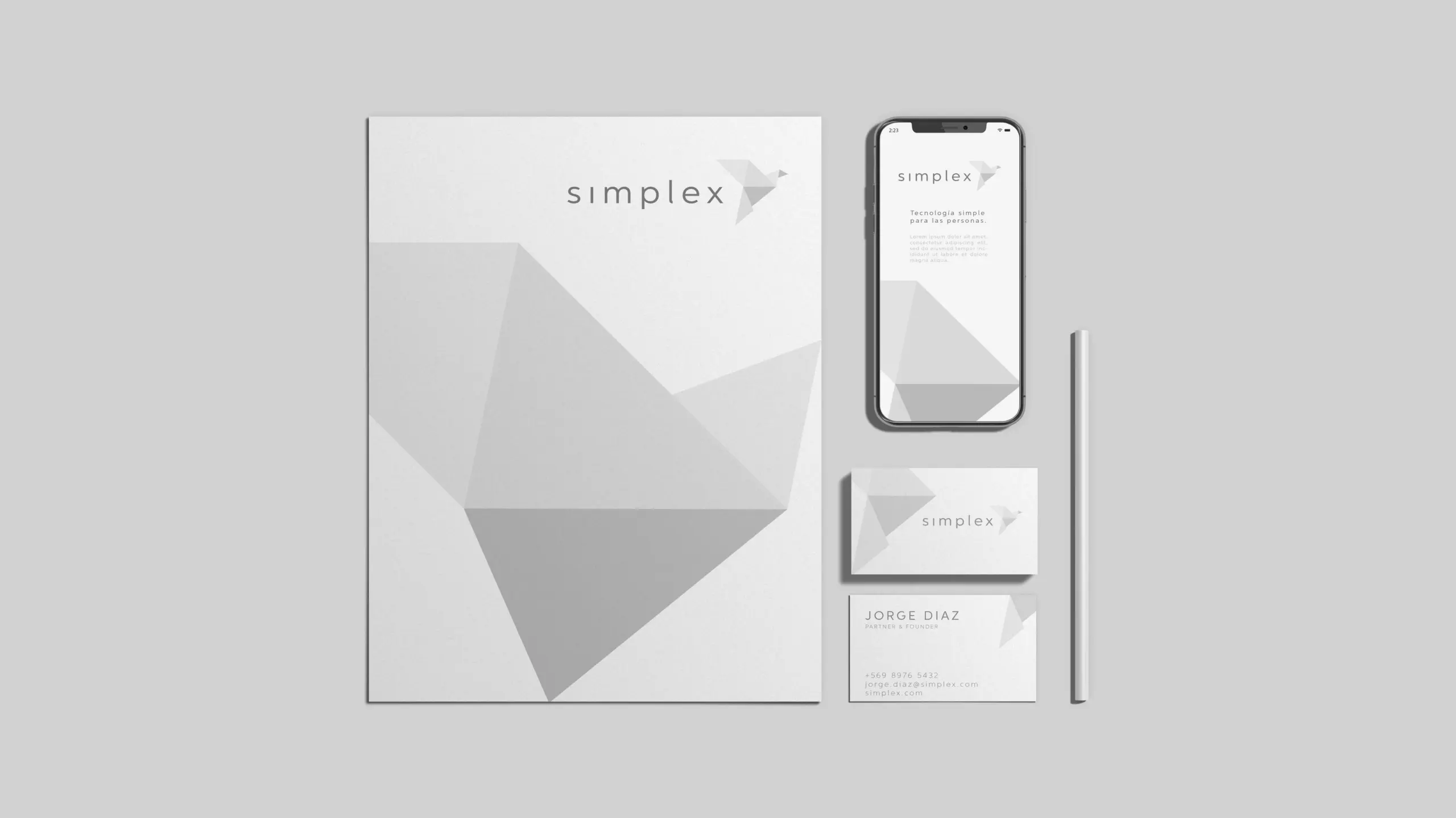
Branding
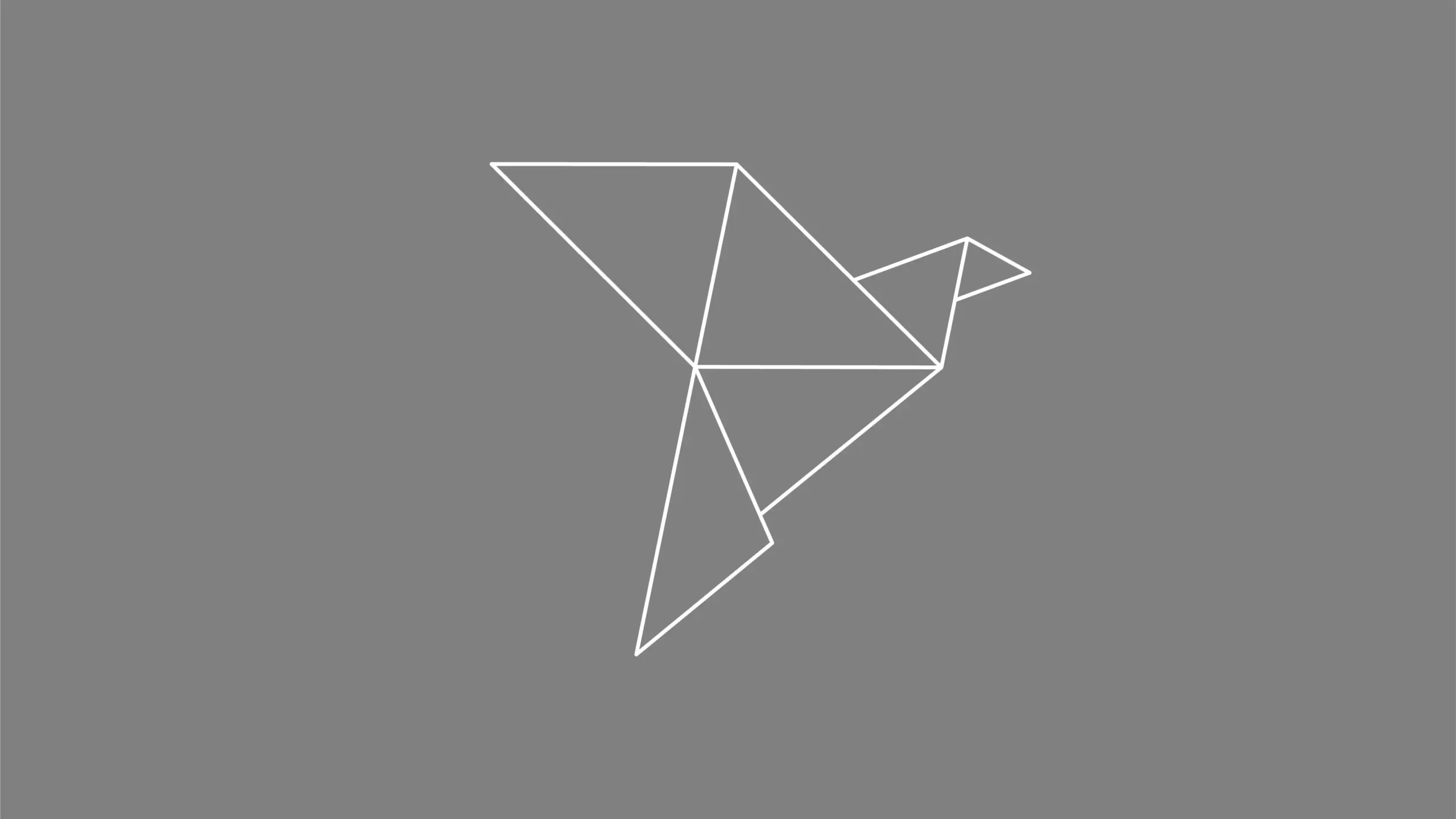
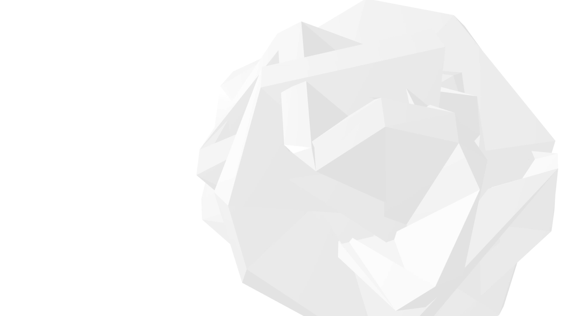
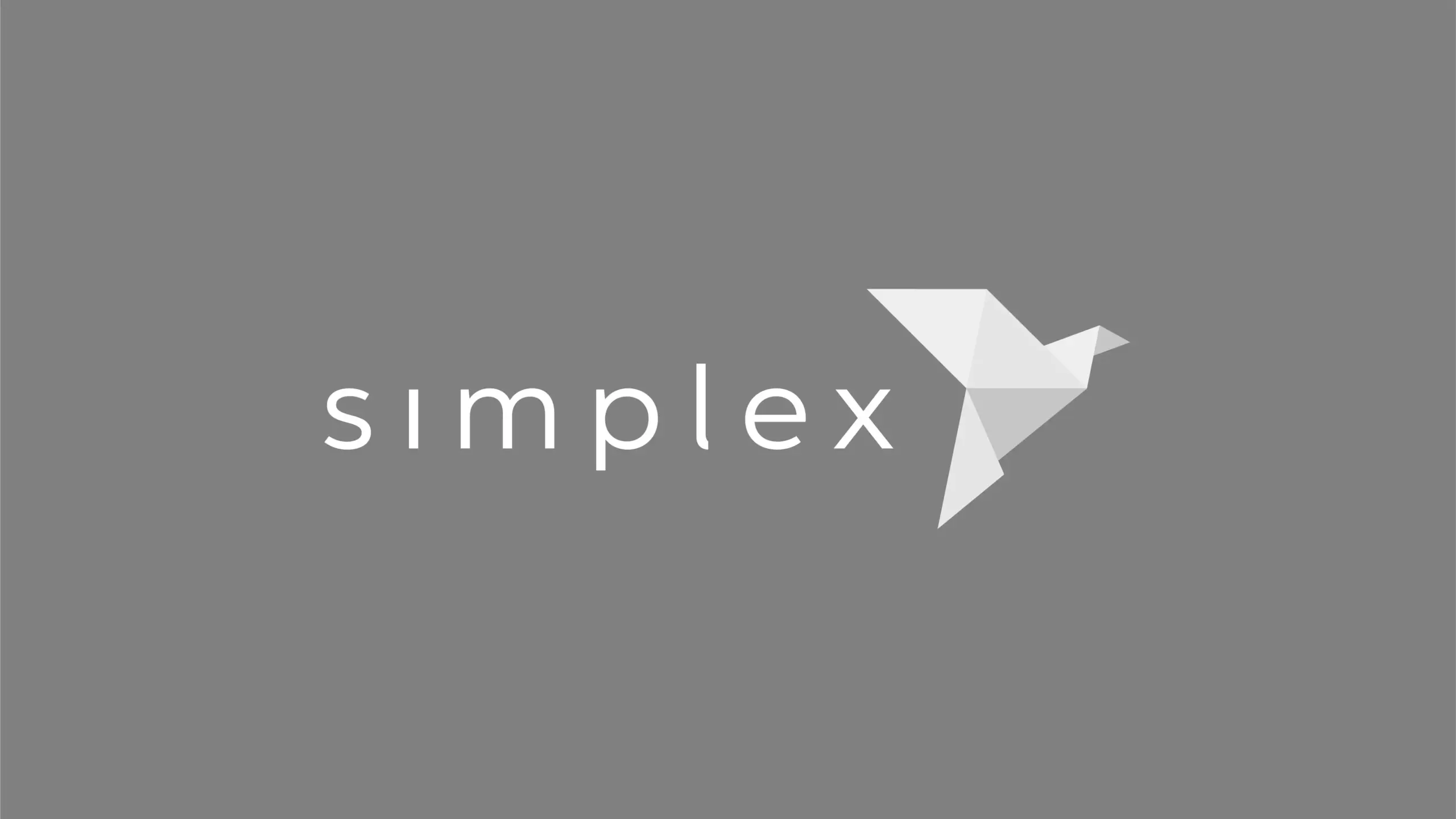
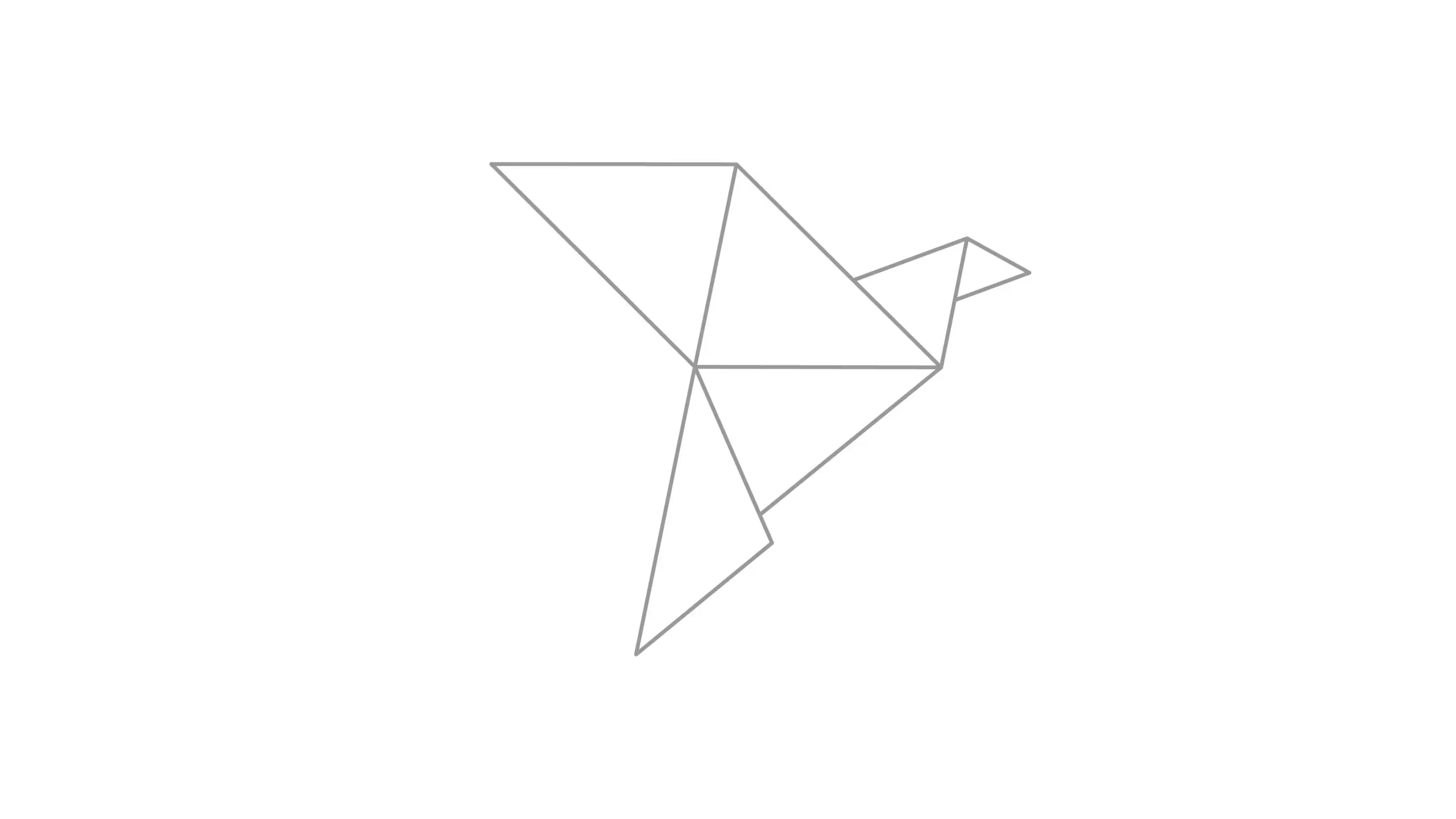
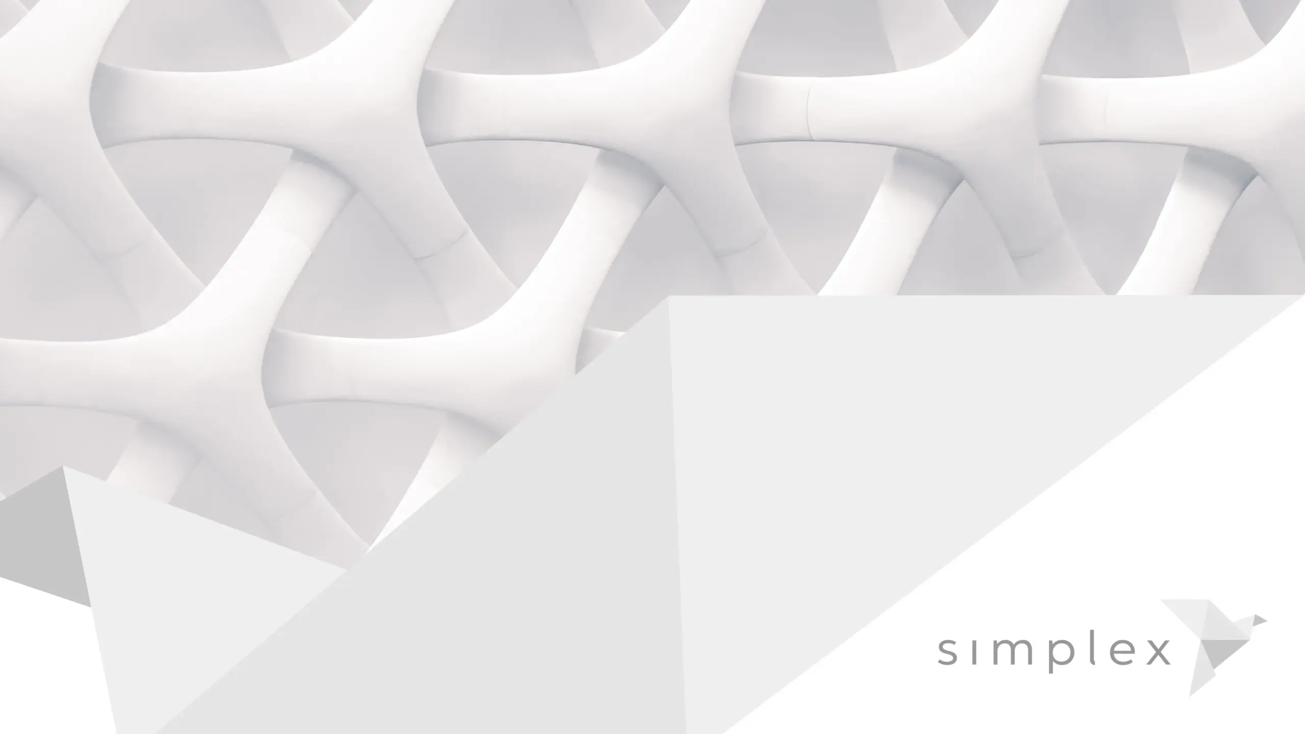
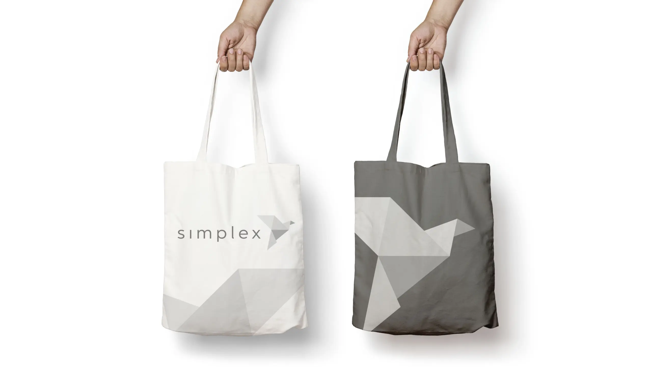
At that point, the old name—“SodLab”—came into question. Even something as simple as stating it at a client’s reception desk was a challenge; people just didn’t get it. So we began by choosing a new name: “Simplex.” Beyond its obvious meaning, the contained “x” comes from the Latin “plex,” meaning “to fold.” That led us to the world of origami, where anyone can fold a sheet of paper into something remarkable—a visual metaphor for this company’s ability to make technology scalable.
Development
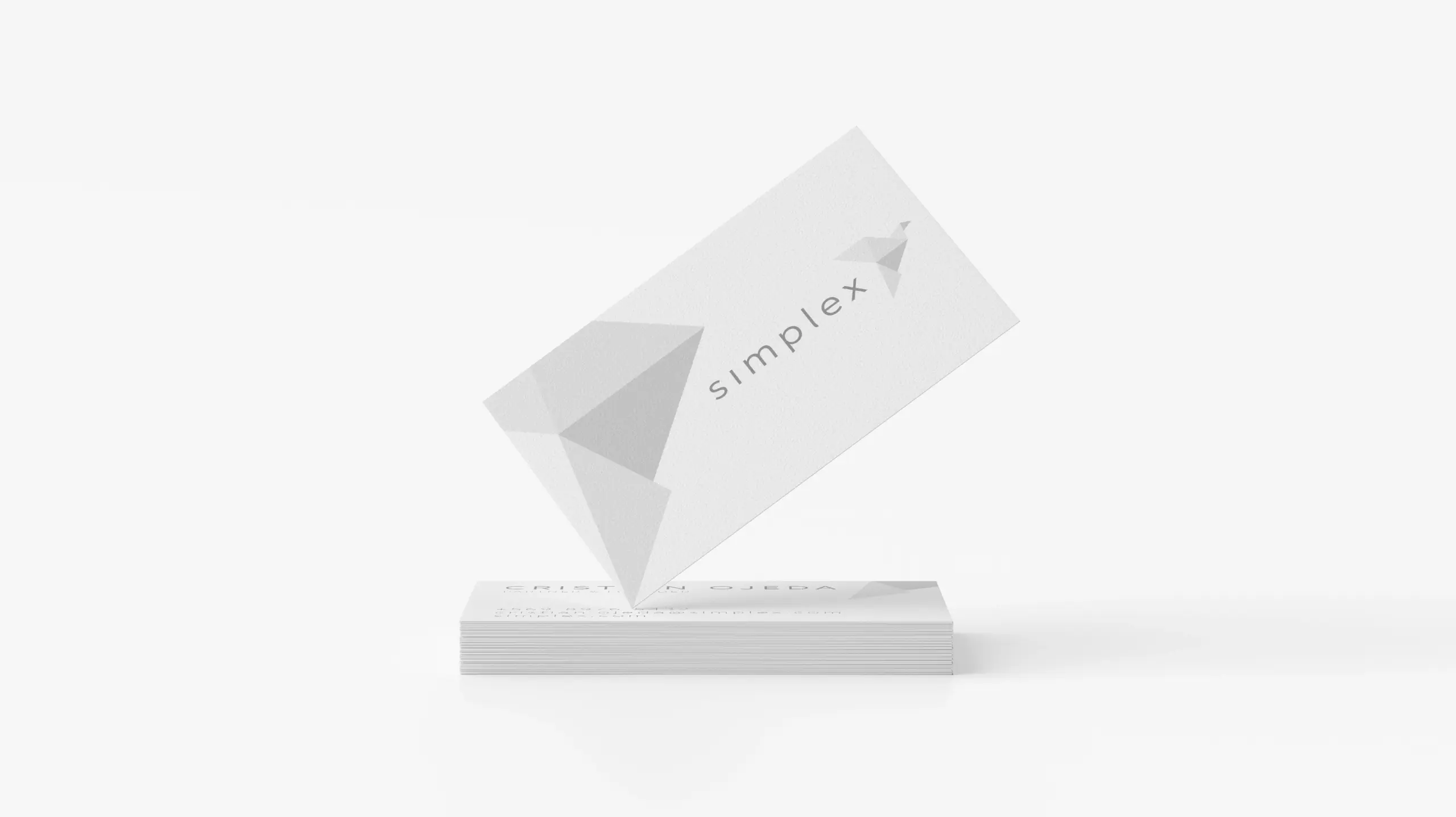
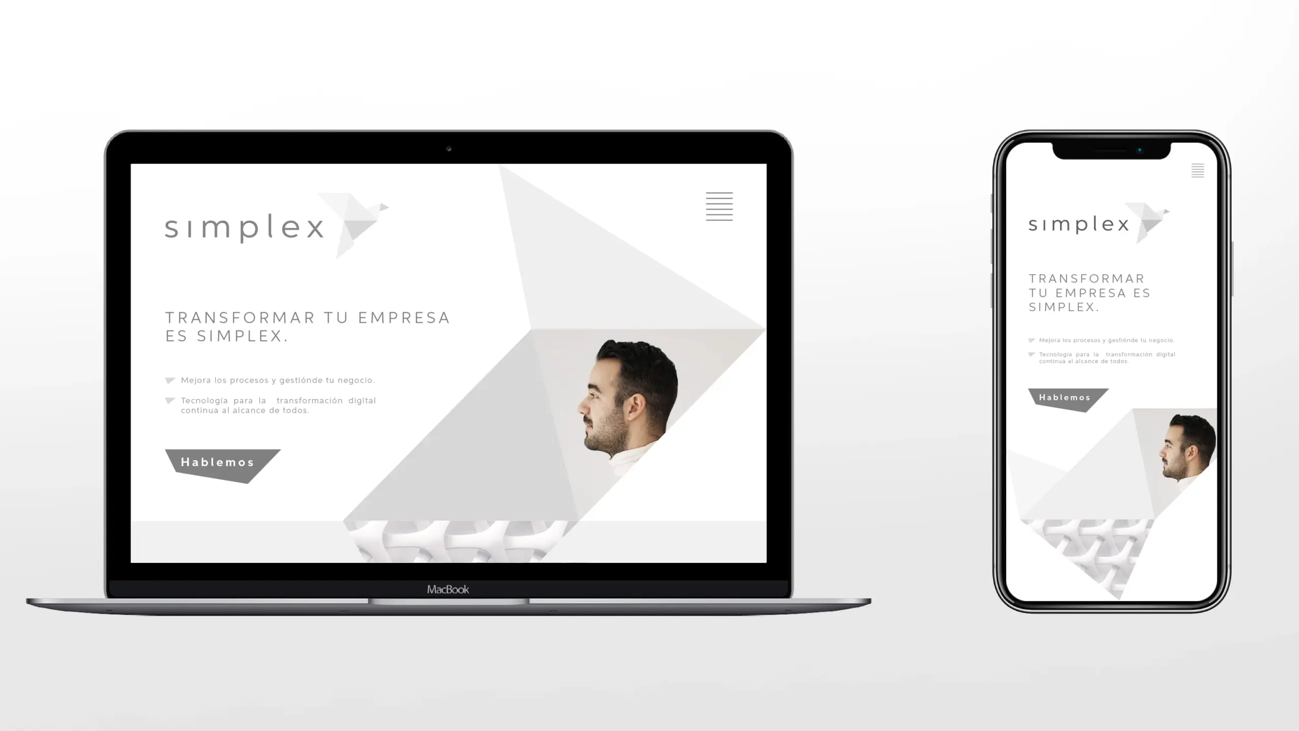
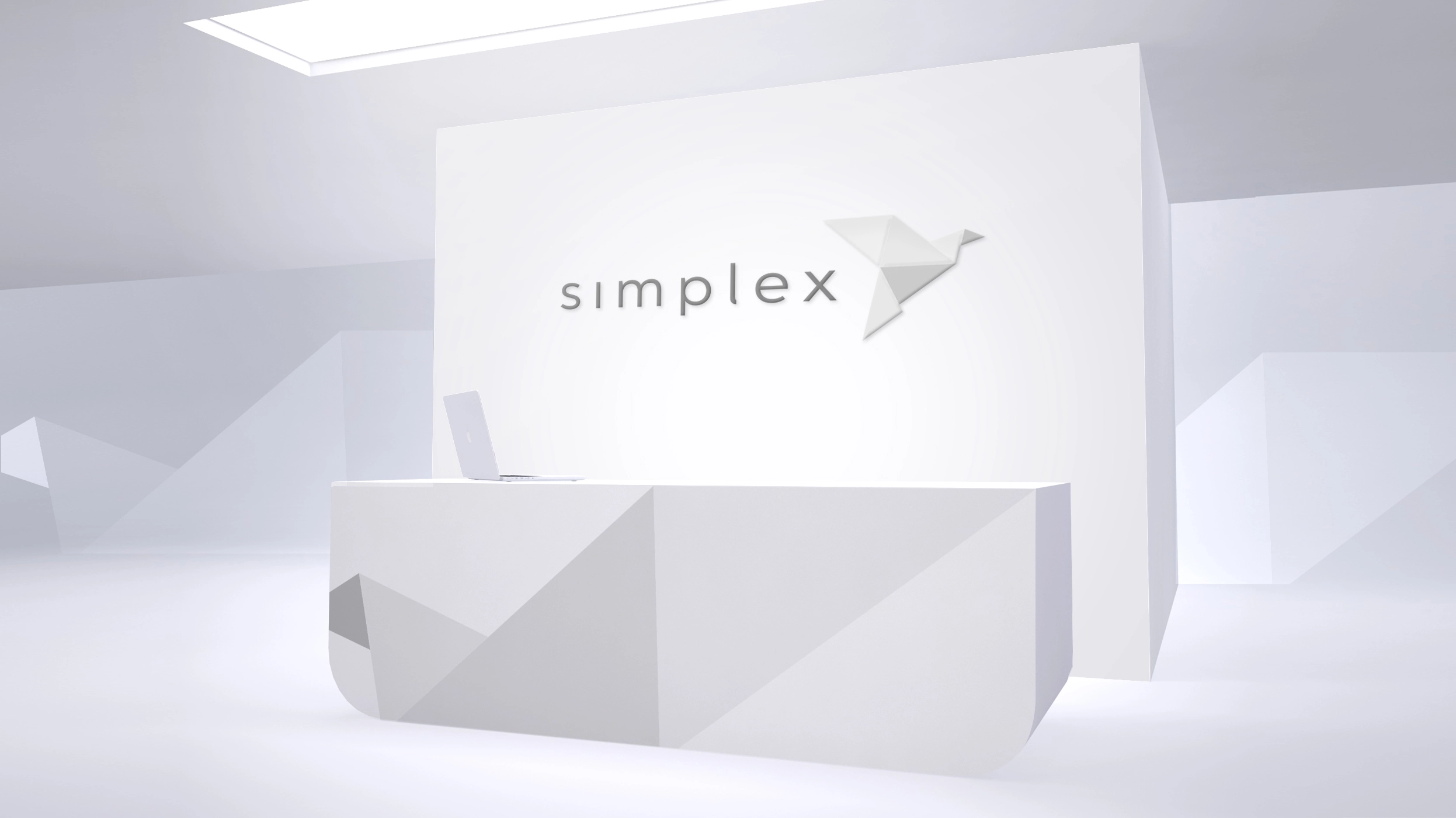
These modular blocks, inspired by origami folds, can take on any shape. They can expand, contract, become a bird—or the next tech solution your company needs. Visually, we chose a grayscale palette: chromatic minimalism for a truly simple brand.
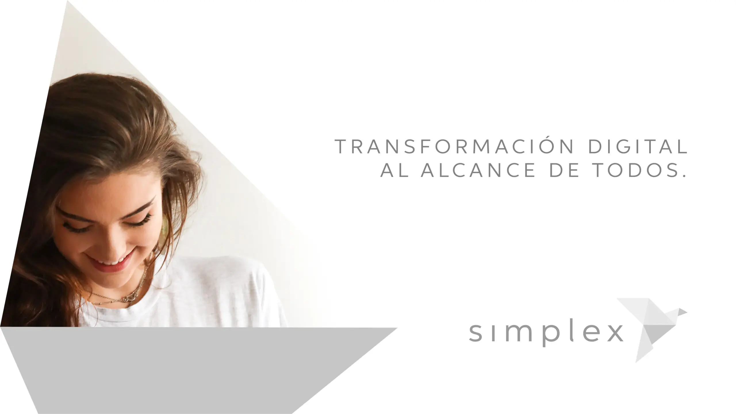
Because at Simplex, we believe it’s not people who should adapt to technology—it’s technology that must adapt to us.
Now transforming your business is Simplex.
Result
Thanks to its new name and visual identity, Simplex has solidified its market position and scaled its growth. The business has evolved as rapidly as technology itself, yet the brand has kept pace with equal agility—meeting clients’ new needs while staying true to its original spark and visual language.
Simplex |
|
| Client | Simplex |
| Creativity | Fuego |
| Art Direction & Motion Support | Maria José Ibaceta |
| Date | 2020 |